Hello,
3.20 it’s approaching, and we have mostly all the changes we wanted in place.
I would like to explain them, so you are aware, and I would like you to test them and provide feedback before the UI freeze this week. So now it’s your time to change the way Nautilus will look and work for 3.20 and improve it for all us to enjoy it.
So what did we do this release? For me personally, I mostly focused on fixes, because during 3.16 and 3.18 lot of changes made in, but it was time with all the experience I gathered to start fixing old and hard bugs. Some of that work is uninteresting for most of users, because they are use cases that are no so common. But still, Nautilus is used in lot of different ways with very different workflows, and I wanted to make sure those workflows were working properly.
Under the hood
As a example of what we fixed is for example this bug about big images (specifically jp2 images) crashing nautilus, and that took me a week working on it. This bug was in nautilus since….forever.
Also, we fixed cases of infinity waiting on search, and spent quite a bit on time on making search more robust making sure the search is cancelled when the users says, making sure we do tied operations at once, or allowing a search being in the history so you can return to it using the arrows in the toolbar.
Other under the hood fixes include showing the free space in the other places view, the “New Window” action in the dash, undiscoverability for the operations popover (although not in the best way we wanted).
Also, since the desktop (edit: Since there was some confusion, I mean the icons on the desktop which we disable by default in gnome-shell/nautilus, not the desktop as a concept) is still important for some users, few issues were fixed like the snapping of the icons, the misalignment of the renaming popover (Thanks Ian!), or the style of the desktop window (Thanks Alberts!). And more improvements in this topic are going to come.
Another point we tried this release is to make sure we care about the distributions using Nautilus, and we tried to fix most of the bugs reported as a blockers for Ubuntu or Open Suse in time for their deadlines. Of course, since I personally use Fedora, and as part of my job, RHEL blockers and Fedora retrace website were my main focus for the most prominent issues.
Ubuntu developers contributed a few patches for Nautilus, and I’m looking forward to see the result of our work in their distribution.
On the other hand I spent almost a whole month working on leaks and ownership in Nautilus, which is the most difficult issue in it, because any file leak means a crash or misbehavior later on. So we refactored, improved and modified lot of code inside Nautilus, and I’m happy I reserved the time and energy to work on it.
But now to the most enjoyable part, the UI changes.
UI Changes
Felipe Borges (thanks!) provided Nautilus with a shortcuts window, so now you can know in a quick look all of the Nautilus shortcuts. The final result looks like:
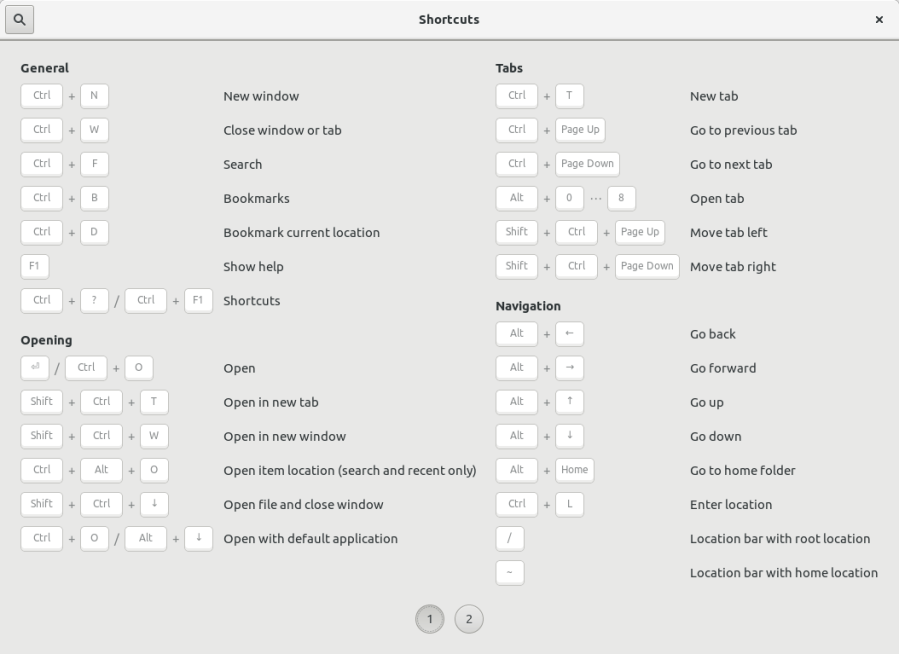
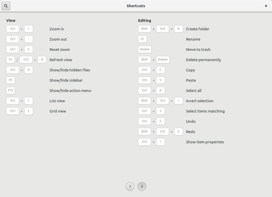
I’m excited we finally have this! No more digging through the code to find them…
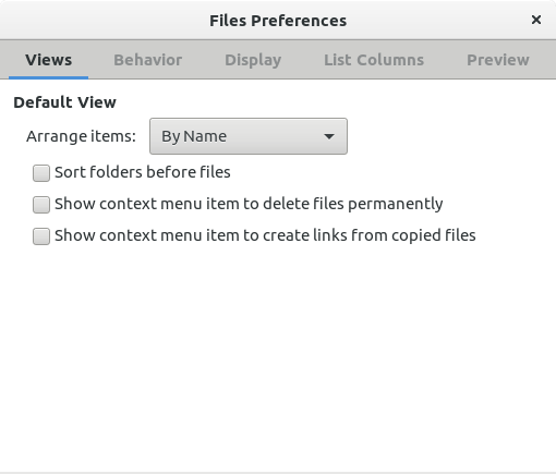
We added a few options to Nautilus preferences, due to either not having a good alternative to them (create link for files, thanks Razvan!) or because sometimes simply there are too different use cases to merge them together (delete files bypassing the trash).
The result is:
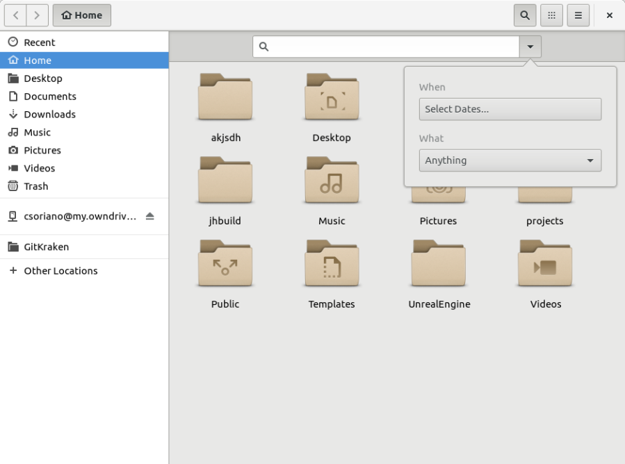
And finally, the biggest change of this release. The new search popover UI, designed by Allan Day and implemented by Georges Stravacas (aka ubiquitous code machine)!
We still need to discuss some more functionality in the mockups, but the most important functionality is already there.
This is the result (Note that the style and colors is still under progress and have some issues):
Then we click the “Select dates” button and…
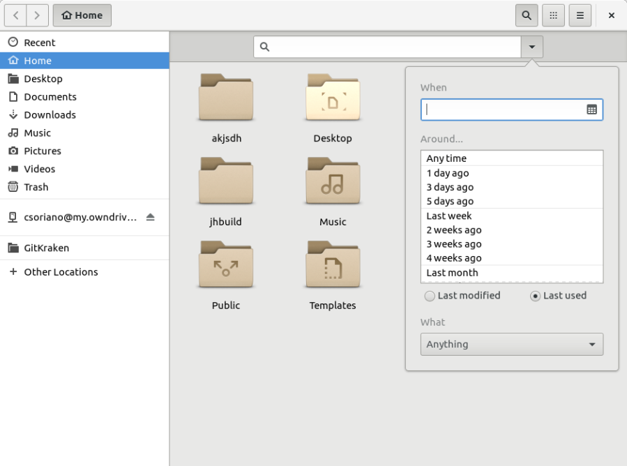
Now you can filter by time the file was either last used or last modified!
But not only that… how about if instead of “since 1 week ago” we want to filter for files modified on a specific date? No problem, we click the calendar icon and we get:
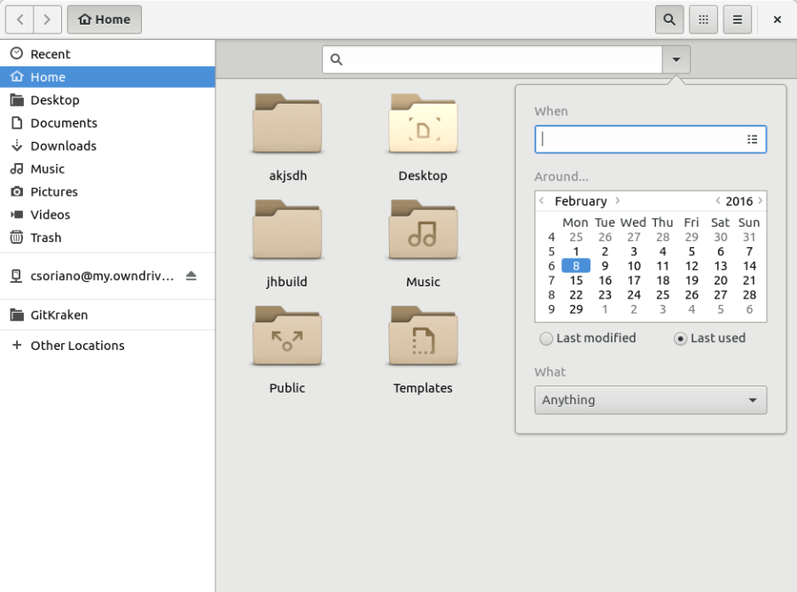
And here you can select the specific date.
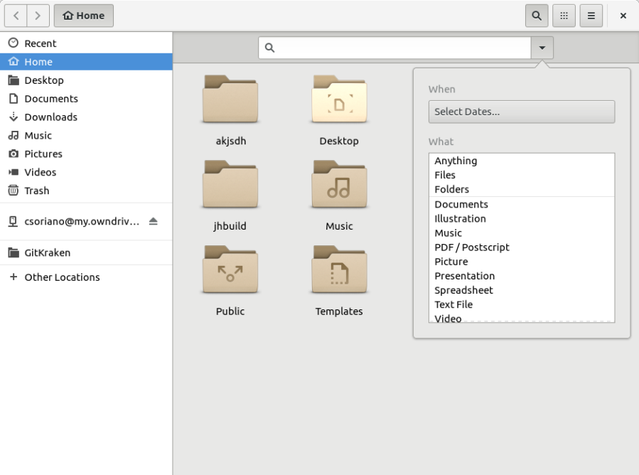
What about filtering by type? Now we can do that, select the “What” you want to search for, the result is:
And you can search for any type of files you want. Let’s create an example. I want files that are PDF and that were modified the last week. Let’s select the filters and we get…
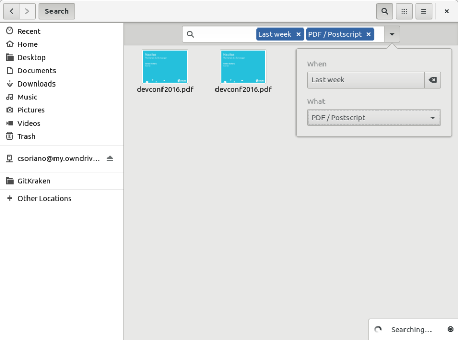
Ta-da! We also have the entry tags to provide feedback about what filters are on in case the user close the search popover, and you can remove them clicking either in the popover or in the close button inside the tag.
So far, for me this is much more convenient and powerful than the previous search, and finally we can kill the myth about not adding features to Nautilus 😉
On the other hand, we had a sad history regarding recursive search, we were not performing recursive search in remote locations, but we didn’t provide any option to enable it, and vice versa for local locations.
We wanted to improve this situation, so as a first step we created two different settings, one for the remote locations and one for the local locations, so the user can make a choice on performing a recursive search independently.
For the UI, we first implemented this as a switch in the search popover.
However, in my misunderstanding, I though that switch in the search popover was the representation of the setting itself. That means, whether you change that, it will make the choice permanent for the type of search you are doing (remote or local). But designers corrected me about it, the search popover is meant to be temporary, the filters about dates and types are temporary, and therefore any element there should be temporary. So that brought me to a difficult choice:
- We add the switch to the search popover and any change there will be just temporary to that search, expecting the user to expect the recursive tool to be most of the times a temporary choice or…
- Add a settings in the preferences dialog and make the setting permanent, expecting that choice to be persistent through future searches or…
- Both of them.
However, a similar decision kicked us previously…. with the view settings. That is, the choice of whether you are using the list view or the icon view, or the sorting of the files, whether you sort them i.e. by name or by size.
Before 3.16 any choice in the view menu was temporary, however users were confused because they changed the view type or the sorting type and the next time they open a directory or create a tab or a window everything was reset. We received more than 10 bug reports about that while I was working for 3.16, and I had to point them that those settings were temporary and that any permanent settings is in the preference dialog. Needless to say, they were confused, frustrated and angry about it.
So I understood that was not a great choice and moved everything on the view menu to be a permanent setting, and luckily that worked and didn’t received any more bug reports about it or against that change.
Thing is, with the recursive search is even more important, because seems that’s a sensible topic for some users, and what we need to avoid is making those users confused and frustrated about the recursive search setting being reset every time they perform a new search.
So in order to avoid that I took the safest path and removed the switch from the popover and added a settings in the preference dialog. This assumes that the most usual workflow is to make a permanent choice about if you want recursive search on local or remote, because either your hard disk or internet connection is fast enough to perform a successful and fast search of the file the user is searching for or is not.
So this is the result in the preferences dialog:

In others news, I’m quite happy that Nautilus continues to attract newcomers to its development, and they are making a great difference on it.
On the other hand I want to thank all the people involved in this release and those who helped me with it, and also my employer Red Hat and Jiří to give me the freedom to work on what I consider important.
And that’s the major changes we did for 3.20, hope you like the work!
PD: To safely test this and provide feedback you can use Gnome built iso images which are a live system built every day from latest Gnome. Check it out.

Thank you very much for the blog post. Looks like Gnome 3.20 will be again release with some nice improvements and my biggest gripes with Nautilus continue to be resolved one by one 🙂
“Ubuntu developers contributed a few patches for Nautilus, and I’m looking forward to see the result of our work in their distribution.”
That is doubly welcome given Ubuntu’s history with Gnome. I was surprised to read this as Ubuntu downgraded Nautilus just recently (IIRC). Do you have any insight into their motivation/plans? Is Canonical going to use the latest and greatest Nautilus again?
Yes, I speak with Sebastian regularly, and we try to adapt each other.
However, Ubuntu 16.04 is still a LTS, and they didn’t have enough time to test all the changes we did, so we talked about several options like shipping both 3.14 and 3.18 and maybe switch default to 3.18 for 16.10. But everything is to be decided, there is too much work for Ubuntu in the desktop team, and with the fast change pace we lately had we cannot provide from upstream all the stability they were looking for 16.04 at least with the thigh deadline they have for this month. But we are still going to improve 3.18 further, because is the one that is going to be use in other enterprise distributions.
So I think a compromise is needed here, and we will discuss it further.
As for the history between Gnome and Ubuntu, I think most of misunderstandings between Gnome and Ubuntu are done by the people not involved neither in Gnome or Ubuntu 🙂
>>”…since the desktop is still important for some users…”
Hope you’re being facetious, since Gnome is a “desktop” environment.
Oh! Didn’t think it could be interpreted that way. I meant the desktop part of nautilus, the icons on the desktop, not the desktop as a concept.
Let’s see how I can rephrase that…
At first I interpreted it as a nice jest (“tablets+touch taking over the world, no need for traditional desktops anymore”) but a few seconds later I realized that you probably meant “symbols on the desktop” 😉
“Before 3.16 any choice in the view menu was temporary, however users were confused because they changed the view type or the sorting type and the next time they open a directory or create a tab or a window everything was reset. ”
Exactly. I always got in a dir and change the sorting type because it was reset. It’s frustrating. I found out these days I could do a permanent change in settings (d’oh)…
Another thing I miss is the possibility to create a new file from context menu (like Windows 98 :). I really don’t know how the people do that. I create from terminal, using touch, ou duplicating a text file. It’s really ridiculous that I should do that.
About the recursive search, I really think that should be possible disable it on settings *forever*. It’s impossible use it when you have an HDD. I fallbacked to gnome2 when gnome3 arrived and I went to gnome3 only when I got a SSD.
Now I *really* like the recursive search, but it’s frustrating when designers simply lock you in settings *they* think it’s ideal…
Thanks for the post.
“Exactly. I always got in a dir and change the sorting type because it was reset. It’s frustrating. I found out these days I could do a permanent change in settings (d’oh)…”
Yeah I know… but fortunately just use a newer nautilus and you will have it as you expect 🙂
“Another thing I miss is the possibility to create a new file from context menu”
This is call “Templates”, and it’s much more powerful than Windows 98 creation of files. Just put the files you want in the Templates folder in your home directory and you will have the New Document menu.
I know it’s not very discoverable, but I don’t know how to make it more discoverable.
“Now I *really* like the recursive search, but it’s frustrating when designers simply lock you in settings *they* think it’s ideal…”
I don’t understand this sentence, but I will try to answer from what I understood. The problem is that the popover filters are temporary, but I would expect the recursive choice to not be. So it’s difficult to find a place different than the search popover for it, however the preferences dialog exists just for that, for these kind of permanent preferences, so it seems make sense there if the search popover cannot be the place.
” Yeah I know… but fortunately just use a newer nautilus and you will have it as you expect ”
I’m running 3.18, and always up-to-date on debian sid. I’m a beta tester for debian stable 🙂
“Just put the files you want in the Templates folder in your home directory”
Man, this is freaking awesome… hahaha, I never knew WTF was that dir… I thought: “Why would I like store ‘my templates’, like I do with ‘my pictures’?”
“I know it’s not very discoverable”
Yeah. I would never find out that. I suggest [Tricks for Gnome3](https://wiki.gnome.org/Gnome3CheatSheet).
“I don’t understand this sentence, but I will try to answer from what I understood. ”
It’s just a complain (not about the recursive search) about how the designers/developers ‘remove or change things’ on Gnome and “that’s it”. For example, recently there was an issue about the icons size (now there are only three options). It doesn’t bother me, because I only use list style, but I saw a lot of users angry about it…
BTW, thanks for the answer…
I cannot reply more levels (wordpress yay), so I reply here.
I guess you can guess if it would be a matter of just adding more zoom levels to the icon sizes, it would be already done 🙂 it’s actually a technical problem which involves changing the whole views of nautilus! we can just offer three choices and still being able to allow such difference of sizes as current ones. However I’m not happy with the current solution either, and I’m trying to find a middle ground for it.
What we ultimately need is rework the views of nautilus, that would be without a doubt one of the biggest works on nautilus ever done, but I’m planning to tackle it step by step (and I already started with under the hood work in 3.16 and 3.18)
one thing I always disliked about this (new file in “Templates”): Most of the time I just want to create an empty text file and I don’t use more templates. Nevertheless in the context menu I have to select new document – empty textfile. Ideally there would be no secondary menu if you only have one item. Is that against the HIG? Or just something which nobody tackled so far?
It’s not a HIG thing I think. Just a decision on Nautilus side.
I’m not sure if would make sense to put a single entry there and change it in case you have more than one template. Seems like a bad transition between having one or more than one.
And I’m not sure it would look fine something like “New document of type name.blend” inside the menu.
Well, I always dislike the extra item to select, especially because sometimes I miss the secondary menu (as GTK does not implement something like https://github.com/kamens/jQuery-menu-aim) and then I have to re-do it. As for the “how to make »new files/Templates« thing discoverable to new users” I think this should warrant a section in Nautilus preferences which could also link to a help page.
Thanks! Looks good and well thought.
I just noticed *now* that you cannot select a file from the search results with the keyboard, as long as the search is still recursing through sub-directories. Looks like I will probably turn off the recursion for both, local and remote and therefore will work plainly with my loved “Type-Ahead-Navigation” 🙂
That options are great 🙂
You’ve added useful options and features to Nautilus!
Thank you
PS: Will there be any iso-images for easy testing?
“I just noticed *now* that you cannot select a file from the search results with the keyboard, as long as the search is still recursing through sub-directories”
This is something that needs to be fixed. It’s one of the biggest stoppers to use the recursive search, and I have been thinking on how to do it for some time. Hope I can tackle it down before 3.20.
“Will there be any iso-images for easy testing?”
Gnome-continuous produce iso images built from latest gnome every day. Check it here: http://build.gnome.org/continuous/buildmaster/images/current/
And actually you gave me the idea, I will put this in bold in the post so people is aware of this to easy try it.
Thank you! Download startet already.
First time ever I test a GNOME release before it is final 🙂
Thanks Carlos, for the blog entry and all your work! I am glad to see that Nautilus is moving forward. Also, I am happy that the first part of displaying free space again is in 3.20 and hope that the second part of this feature (instant visualization of free space as discussed in the related bug entry) comes soon, too.
I always liked Nautilus, but I am one of those who diverted to Nemo after Nautilus had the major redesign having had dropped some everyday-useful-features. After 3.20 or 3.22, Nautilus will be on the top again and there will be no reason to use any other file manager anymore. 🙂 Cheers!
Thanks for the words of support even if your choice is to use a different project.
That’s really appreciated.
Cheers!
Any chance of adding a miller column view any time soon? This is one of the big features missing for me, causing me to use the ranger file manager quite a bit.
This is bug https://bugzilla.gnome.org/show_bug.cgi?id=96239
No I’m afraid. If I remember correctly designers didn’t like that. But I didn’t investigated further.
Thanks for the changes, looking forward to 3.20. Especially the new old instant delete option on right click , the search options and the shortcut widget are much appreciated.
Any chance the padding between icons in grid view will be increased again?
Currently the grid view looks quite squeezed and causes many ugly multiline (file/folder) names where Nemo shows just one line which looks considerably more pleasant.
I’m experimenting with icon sizes and paddings again for 3.20, it’s a difficult balance because the views of Nautilus are difficult to deal with, but we will see what can we do.
Thanks for looking into it.
Don’t waste our time with this project if you don’t try bring “F3 split screen / 2 plane view” which is only reasonable work mode with multiple files on desktop.
I understand, just ignore my blog then, neither of us want to waste our time.
noproblemo I’m returning to boring word where people try use software in work…
BTW do you ever try use it on tablet (for example with lots of photos) because all my try bring me back to terminal.
Man, you’re boring… Really!
Seriously? “Only reasonable work mode with multiple files on desktop”?
That is very limited and narrow view. As I would say that “the only reasonable work mode” is to have multiple views to multiple directories at once. I want to copy file from Home to NAS and then to USB drive. That is from one location to two locations. Dual mode doesn’t help there as I am totally stuck to two places. Instead I need to open three window and copy one file to two directories separately. And the _only reasonable work mode_ is that we have _windows_. We have windowing environment, so we can open multiple windows at time and scatter them around the screen and handle the multiple files around.
And once you start managing files, you want windowing environment instead single view or single window with two views. You want multiple views.
You organize files like:
Copy pictures from Home to NAS.
Move videos from Home to USB.
Gather project files in Home and archive them and then copy to two USB.
In that example you have one directory all the time open, your home, and you are going to sub-directories in it. And you find and gather files that you then relocate or copy to multiple different location at once. And if you have dual-view mode, it is not going to help a thing.
So how about 3-4 viewmodes in the Nautilus, just like the Konqueror has? It was awesome filemanager back in the days (just like you can still use it today).
Sorry, sure Nautilus could at least get someday the twin-view mode (if it doesn’t have it) but that is not “only reasonable work mode” as many twin-view fans like to say it is. It would be if you would have only possibility run single instance of the filemanager and that in full screen.
I think the shortcut screen would look better if the button icons were right-justified, so that there is a fixed gap between the buttons and the explanatory text. Without it, it’s a little harder to visually connect the key combinations with their explanations. (This is the same reason there are leader dots “. . . .” in tables of contents.)
This would have a side-effect of aligning the most important part of the shortcut (the last key), so that you could quickly scan down the list looking for the non-buckybit-key, e.g. the “R” key in “F5 / Ctrl + R” would be right above the “H” key in “Ctrl+H”.
I’m not sure it would look so good, but worth trying!
One note, keep in mind that you can search for shortcuts in the shortcuts windows either by it’s label or shortcut.
Hello there, Carlos
I’ve got some ideas to improve GNOME’s Nautilus File Explorer.
Now this might sound like yesterday’s news, but Nautilus 3.4.2 which comes in Ubuntu Precise Pangolin does not have the Format Menu. This might have been fixed before, but since I never left 12.04LTS, I cannot tell so please give us the formatting function if possible.
One other issue: Partition Size Notifier. Yeah, that bar located under the partition icon. Once a disk partition has been mounted, Nautilus could let the user know the space left with an indicator – usually a bar or a number, for example:
Rodolfo (37% ext4)
______________
|||||||||||||||||||||___|
/dev/sda1
So “Rodolfo” is the disk label and then I have the space remaining, file system and the partition location.
Much more informative than it currently is, don’t you think?
One other idea I’d like to see implemented is a simpler way to manage my network folders.
You see, I have to edit my fstab every time I want to open a network folder (which is available when the system starts up), just so Nautilus can see and “mount” it. I also have to mess with fstab in order to let the other users read-only or write; not to mention my backup procedures could be much simpler using Nautilus GUI instead of having to use everyone else’s PC and edit their fstab files.
Anyway, thanks for the heads up. Keep up the great work!
About the formatting function, you mean for the dates? I’m not sure it’s so useful. There was a discussion about it. We just use the local format, so we already follow your configuration.
About partition size, I guess you mean displaying the free space to know how much items you can put inside. There was a long discussion about it, the problem is that the sidebar is not a good place to put some indicator, but we were looking into it (but don’t get your hopes up). You can search for that bug report in bugzilla.
I’m not sure about why you need to use fstab, nautilus mount network folders if they are there, or you can access the network folders through the “Other Locations” view.
Cheers.
You misunderstood a few points I made, but I’d like to make an other request. i hope I’m not too late for the party and the features windows is not closed yet.
Please all nautilus to have a customizable background color, as well as the interface.
Sometimes that white in your face is not really necessary, so switching to a darker color would go easy on the eyes. As for the interface, I think it’d be a great idea to enable skins for Nautilus, if that isn’t that much of a trouble for you. So what do you think?
UI freeze is already over, so no more things for 3.20 🙂
“Please all nautilus to have a customizable background color”
That is what the theme does.
“to enable skins for Nautilus”
The same, just change the theme used. Nautilus just use css, you just need to change its properties.
Please have a look to this annoying usability issue.
https://bugs.launchpad.net/ubuntu/+source/nautilus-open-terminal/+bug/597678
I cannot look to every bug report. However in this case, we were looking into it because it’s a general problem. A good solution is still to be determined (maybe an action bar, etc. You can look at gnome mockups in github).
Don’t let me take the credits on that – I just did the initial, poorly working implementation. If it works good now and behaves properly, it’s really your fault and YOU should be blamed about that 😉
/me runs evil-laughing
First i have spent a look to my Calendar. No, it is not the First of April. You actually added a function instead of cutting one more. So there is hope i can call Nautilus one Day a “File Manager” again…
I wouldn’t say “added a function”. I’d say “properly added a function”. Adding functionality is easy, doing it correctly is much, much harder.
In Spanish:
Elegante y funcional lo nuevo que trae Nautilus. Se agradece.
Otra cosa que le hace falta a Gnome Shell, es poder visualizar el nombre completo de una aplicación el la app grid, a través, por ejemplo, de un tooltip. Eso, pienso como muchos, sería muy bien aceptado.
Saludos…
Es verdad, pero no creo que un tooltip sea lo mejor ya que no es una solucion para dispositivos tactiles y no se puede descubrir facilmente.
En cambio creo que hacer multiples lineas sera mejor, almenos dos, pero no recuerdo la discusion. Puedes buscar el bug en bugzilla
Ok, muchas gracias.
Igual se podría implementar esa solución de múltiples líneas por defecto, no???
Saludos desde Chile…
Si, definitivamente. Creo que solo esta esperando alguien que lo implemente. Saludos
Hi Carlos,
thank you very much for working on nautilus! I use Gnome on a tablet and there are two cavecats regarding nautilus:
– hold for context menu doesn’t work
– doubletap to open folder/file only works in grid view, not in list view
The two things have been resolved in the gtk file open/save dialog some time ago and it works amazing. The context menu became a popover (as only that is what works on touch as far as I’m aware), the list view not being tapable is some bug I guess (?). It would be very nice if nautilus could catch up in that regard 🙂 Especially with the enormous gain in popularity of convertibles (e.g. microsoft surface book) and the general way Gnome is headed. (btw this is the bug report https://bugzilla.gnome.org/show_bug.cgi?id=759788 )
thank you very much for the work you do! greetings
Hello,
Interesting comment, I have a touch laptop and definitely I want to improve touch experience. Not only that, it’s on our roadmap for Gnome and actually an important part in enterprise distributions like RHEL.
So for context menu, we are probably going with an action bar with buttons instead of relying in hold.
For list view, we are going to use a new widget which, as the sidebar now in 3.18, allow to work with touch easily.
As you said, we could fix it like the Gtk+ file chooser, however, we are still unsure if we want popover for every context menu in Nautilus (I would say yes, I do).
So count with it for 3.22, which I would say is the limit for providing a good experience for touch and convertibles.
> So for context menu, we are probably going with an action bar with buttons instead of relying in hold.
Whatever you guys decide on, I’m sure it will turn out great 😉
> I would say yes, I do
As far as I can see context menu and popover serve the exact same purpose, only that popover works on touch and looks nicer. Even the file rename became a popover, so I don’t see any reason not to generally replace all context menus with popover
> So count with it for 3.22
I’m thrilled already 😉
Today a layout I made for the onscreen keyboard got accepted, also the osk itself seems to be about to get a major overhaul as well. Great times for touch users ahead!
Nautilus is looking better with one restored function and the new additional functions. If I could have two changes, they would be:
1) on the left, below local folders, and above + Other Locations, show /tmp I often write to /tmp which I call a disposable folder and I make frequent access to it.
2) Restore the ability to unmount a partition by right-mouse click when the mouse is over the partition’s desktop image. This standard feature disappeared with 3.18 (or 3.16) It was available and very convenient.
For tmp, that’s what bookmarks are for. That will add the folder you want in the place you say.
The ability to unmount should be there, but in any case the sidebar allows that anyway, so I don’t think it’s a big issue is it?
I really hope you fixed the big icon problem (not equal to the big picture problem ). That one is a blocker on Fedora.
It’s not a blocker though, current solution is adequate for what is intended for, that seems doesn’t match some expectations.
Sadly, is hard to come with a solution because of the technology of nautilus, but we are looking into it.
Bugreport: i started the QEMU Image 2.2.2016 and enabled desktopicons for home/trashcan/network etc.. the background went white and can’t be changed anymore. It stays white instead of transparent.
Use bugzilla for bug reports. That one is fixed tho.
Interesting that Nautilus is first getting the better search function than Dolphin is, even after multiple wishreports.
But I have a question, when you open that calender view from the search widget and it allows you to pick a date. Does it allow you to select multiple dates?
I mean that the weeks are listen from top to down. So could I click “Week 39” and it would then automatically select Mon-Sun?
Can I click weekday like “Tue” to select all the Tuesdays of the month?
Can I click and drag selection example from Day 4 to day 17 and it will pick all the dates between that?
As sometimes when I see people searching files, they remember weekdays, like “I wrote that document on Friday just after the meeting” but they have no idea was it January, February or March. So they need a way to really specify that it was a Friday somewhere in multiple months.
Well, as far as I know Dolphin doesn’t have a full time maintainer. It’s expected then Nautilus to go faster on its development.
No, the UI doesn’t allow date ranges, however I prepared the code to handle it, for just in case in the future we know a good way to do it in the UI.
For the context menu preferences, it might be better to put them under a separate heading in the view tab so that you don’t need to state that each option is for the context menu:
> [Context Menu]
> [ ] Show item to delete files permanently
> [ ] Show item to create links from copied files
Actually I’m reworking it! take a look at wip/csoriano/preferences-rework
Thanks for sharing stuff like this!
Regarding the search popup I’d expect that search for created date would be used a lot more than last accessed. Maybe they should/could be switched?
Or maybe it should be a dropdown with created, modified, accessed in it.
Also, will it be possible to type these “queries”? Just like for example ddg or google with “type: pdf”, etc.
An with regards to the search scope, does what you’ve described mean it’s not possible to temporarily change a search’s scope?
” Maybe they should/could be switched?”
What do you mean, both options are there, and by default modified date is used.
“Also, will it be possible to type these “queries”?”
No, we would need a small parser for it, I prefer UI than random text structures.
“An with regards to the search scope, does what you’ve described mean it’s not possible to temporarily change a search’s scope?”
Yes it is possible
This looks fantastic! Thank you for your work!
I have one concern with the specific setup shown here, though. I believe that using an arrow just to the right of the search box is a big mistake and I urge you to find another solution to this (doesn’t have to be anything more complicated than using some other symbol than an arrow, or moving the button just a little bit or something).
Let me explain: I believe most users will see that button and don’t understand that it’s a way to change the settings for the search. I believe most users will be so used to seeing this setup and having that arrow button show them either what they have typed in to the text box previously (think the addressbar or search box in a browser) or some other different choices for what text should be shown in the text field itself (think drop down boxes) that they will not notice at all what this arrow button actually does until they want to search again for something they’ve searched for before.
Then, when that happens they will become doubly frustrated because:
1. The button did not do what they expected, and they where not presented with their search history as they had hoped for
2. They will wish they’d known about these advanced search options earlier and be annoyed that they where hidden in this unintuitive way.
So please don’t break convention and user expectations in this way! Just change it slightly (as I said: An other icon will do. Or maybe move the button to the left of the text field instead of the right. Or something).
Other than that, thank you again so much for your amazing work! I use Gnome every day and I love it!
Thank you for all these great updates! I really like the keyboard shortcut overlay, that will be very useful!
One feature suggestion for upcoming Nautilus releases would be to have an option for making view settings persistent on a per folder basis. I know this was possible in earlier versions of Nautilus and in the Nemo fork, but it seems to have been removed in newer versions of Nautilus. The use case scenario would be to always have my downloads folder as a list sorted by date, my picture folders as big icons and most other folders as lists sorted by name.
I found a couple of bug reports on the ubuntu and gnome forums (https://bugs.launchpad.net/ubuntu/+source/nautilus/+bug/1152226 and https://bugzilla.gnome.org/show_bug.cgi?id=683802). Do you know if this is something that is being worked on currently? Alternatively, is there a place where I can vote on or donate to development of specific features in Nautilus and have them added to the roadmap on the Nautilus homepage?
Downloads folder already uses sort by modification date by default. Maybe you changed it?
But no current work to allow setting per view, neither is probably something we want right now.
You can use bounty source or things like that, but I recommend talking with the maintainers before to see if what you are paying for is wanted or not.
The roadmap is based on what we work on or what we decide makes sense as a next step. Better way to make a distinction in that roadmap is getting involved (designer, testing, translation, bug triaging, documentation, code,etc) 🙂
Thanks for you swift reply csoriano!
I tested with Nautilus again and you are right, Downloads are sorted by date by default. Actually, any sort setting I apply, seems to be remembered on a folder per folder level after reboot. So that is great! This was the most important part of my feature request and I am happy to find that it is already implemented.
I don’t completely understand why the view settings (icons vs list) are treated separately from the sorted-settings and not saved per directory, but this is a minor issue. Especially since I just discovered that Ctrl+1 and Ctrl+2 to quickly toggle between the list and icon view!
Thanks again for the heads up and also for the tips on how to get involved! Keep up the good work!
“Other under the hood fixes include showing the free space in the other places view” — I apologize if this isn’t the correct location for this question/comment/reply but DDGo searches haven’t been overly helpful with regards to “Other Locations” and this seems to be the Home Base for Nautilus info. I’ve been sticking with 3.16 because I couldn’t find a way to disable “Other Locations” or make some partitions truly “persistent.” I use numerous partitions and many of them quite frequently and it’s cumbersome to activate them or whatever the process is in 3.18 before each use even after bookmarking them. Will 3.20 make using other partitions more convenient? Thanks for your time.
This is the same problem I’m running into and looking for a solution to. I have 16 partitions I use on a very regular basis, and having to keep digging to get to them is extra work for no good reason. I had them all pre-mounted specifically so that they would show up and be available directly on the sidebar in any nautilus window.
[Sorry for double post, I posted on the Gnome 3.20 news by mistake]
Any chance to get the “status bar” back one day or another in Gnome Files ?
It may be hidden by default, and an option added in the “Files preferences/View” options, such as:

[ ] Display Status bar
The goal would be to get a quick overview of the space available on a volume. I (as many users) use that features very often…
It is a basic feature expected from a files manager, provided for example by Thunar, Pcmanfm, Caja, Nemo, MacOSX Finder. Only Windows file manager and Gnome files are missing that essential feature.
Cheers,
Fred
Almost 6 years ago a bug report was posted about it: https://bugzilla.gnome.org/show_bug.cgi?id=684943
None of the Gnome developers are interested in restoring the status bar, they are busy removing other features.
It’s not that hard to read a simple table roadmap as I say to do so in the post to see it has been in the plans and we have 3 prototypes implemented, is it?
Oh well, a troll is a troll, have fun! 🙂
Hey Fred,
Sorry your question slipped through.
First, take a look at oue roadmap and search for “action bar” so you can see the work we have been doing on that front.
Unfortunately we delayed it 2 times already, given the difficulty in design. We were not very convinced about the results.
Regarding “essential basic feature”, well, we have different goals and designs and solutions for the same use cases, so it’s about trade offs. In this case, the current available space it’s not something you need to see all the time, you have space most of the time, don’t you?
Also for local folders, the most common case, you have the same space regarding where in the hierarchy you are, so it’s hardly needed to have that info all the time, when it’s simple available with one right click.
So there is a clear (imo) gain to not have another visual element always present vs the times you need to know that info vs the availability of that info one click away.
So probably the new action bar won’t have the size of the current drive displayed in the action bar.
Regarding having it as an option, an option is always the last resort, users have problems to find and deal with them, and on the maintenability side it always has a cost much bigger than a single solution (even if a single solution means implementing “more”).
We should focus on what use case drives you to need to see the drive size all the time and build up from there. Would you describe your case?
Hey Csoriano, thanks for this bit of insight into the newest Nautilus! I’m just giving Gnome 3.20 its first spin (on Ubuntu Gnome 16.04) and loving it so far. However, I noticed that the Ctrl-1 and Ctrl-2 keyboard shortcuts currently do nothing. I have to change views by selecting them in the menu. Is this a known issue?
I just noticed this as well. There was a fix submitted in late March, so hopefully we get a patch soon https://bugzilla.gnome.org/show_bug.cgi?id=764167
nice . thanks for posting.
Hi. What happened to the ability of Nautilus to sort files by type, as the default view for every folder on the system? It appears the option for the latest updates for Nautilus for Fedora or Arch is missing or removed. It is very cumbersome to set the view for every folder I switch to; are there any shortcuts or dconf settings I could use to get back that option?
Just sort by type in the menu and it becomes the default for every folder. Not sure I understand the question…
Had the same problem on ubuntu 16.10 with Nautilus 3.20.3. The post says that if you select list view using the toolbar your choice will be remembered, for me it was true for the ‘Show Hidden Files’ option, not for the choice between list or icon view.
Very strange : when I do the sequence : left click – right clik – left click (since the list view button has an orange border), then it is remembered forever.
=> Looks like this graphical component (double button for choice between 2 options) doesn’t work as expected on my system, so I suppose the problem is not related with Nautilus, but maybe with gnome itself or my graphical card or it’s drivers.
Maybe it’s the same for you ?
Hi, It’s a great version of nautilus but there’s a problem with icons, you can’t change it 😦 when you see the properties of a folder and click on the icon to change it, the window freezes so you can’t do anything and to close it you have to use escape, is there a way to solve it?
Greetings!
I have found one design in nautilus 3.20 that makes me access hard disk partitions a little bit inconvenient.
I have installed both Windows 10 and Ubuntu on my computer. For this reason, I have to access the files that I work with when using Windows, which means that most often, I will access files not under the Ubuntu system partition.
In Ubuntu 16.04 LTS (with nautilus 3.14.3), the hard disk partitions are listed on the left side panel. I can click once to enter those partitions.
But in Ubuntu 16.10 (with nautilus 3.22), the hard disk partitions are not listed on the left side panel (and there is no way to toggle it on). So I have to go to “other locations” first and click on the hard disk partitions. This makes me cost a little bit more time.
Yeah that’s inconvenient. For that you can use bookmarks to those partitions you access the most (or just folders you access the most). Is that enough for you?
varyforte funziona
Whoa lots of very good material!